Have you ever wondered why some spaces feel instantly calming while others leave you restless? The answer might lie in the hues surrounding you. The right shade can transform your room into a sanctuary of relaxation, helping you unwind and enjoy a good night’s rest.
Studies show that certain colors can influence your mood and energy levels. Cool tones like blue and green are often linked to calmness and reduced stress. These hues mimic the soothing effects of nature, creating a peaceful environment perfect for unwinding.
Choosing the best color for your space isn’t just about aesthetics—it’s about enhancing your well-being. Whether you’re drawn to soft pastels or deeper tones, understanding the effect of each shade can help you make the right choice.
Ready to transform your room into a sleep-friendly haven? Schedule a consultation: Call (347) 618-7787 or visit pristinepaintersnyc.com for expert advice tailored to your needs.
Colors have a unique ability to influence both your mind and body. The hues you surround yourself with can evoke specific emotions and even affect your physical state. This makes choosing the right shade for your space essential for creating a restful environment.
Different colors elicit both emotional and physical responses. For example, cool tones like blue and green are known to lower stress and blood pressure. These hues mimic the calming effects of nature, making them ideal for promoting relaxation.
Research from the Sleep Foundation shows that blue tones can reduce heart rate and create a sense of calm. Similarly, green shades are associated with balance and tranquility. These findings highlight the importance of thoughtful color choices in your space.
Brightness also plays a key role in how colors affect your mood. Soft, muted tones are often more soothing than bold, vibrant ones. For instance, a pale blue or green can create a serene atmosphere, while brighter shades might feel energizing.
Studies indicate that the right shade can improve sleep quality by fostering a sense of calm. This is why experts recommend cool, neutral tones for areas designed for rest. For more insights on choosing the perfect color, check out our guide on selecting the right paint finish.
| Color | Psychological Effect | Physiological Effect |
|---|---|---|
| Blue | Calmness, Relaxation | Lowers Blood Pressure |
| Green | Balance, Tranquility | Reduces Stress |
| Yellow | Energy, Positivity | Increases Alertness |
The science behind color psychology reveals fascinating insights into how hues affect our daily lives. From influencing our mood to impacting our physical health, the right shade can make a significant difference in creating a restful environment.

Studies have shown that certain colors can influence brain wave patterns and heart rate. For example, cool tones like blue and green are linked to reduced stress and improved relaxation. These hues mimic the calming effects of nature, making them ideal for spaces designed for rest.
One study found that exposure to blue tones can lower heart rate and blood pressure, promoting a sense of calm. Similarly, green shades are associated with balance and tranquility. These findings highlight the importance of thoughtful color choices in your space.
"The right hue can transform a room into a calming retreat, enhancing both mental and physical well-being."
Light temperature also plays a crucial role in how colors affect your mood. Warm, soft lighting can enhance the calming effects of cool tones, while bright, harsh lighting might counteract them. Experts recommend balancing light and hue to create a harmonious environment.
For homeowners, this means choosing shades that complement the natural light in your space. Soft, muted tones are often more soothing than bold, vibrant ones. For instance, a pale blue or green can create a serene atmosphere, while brighter shades might feel energizing.
| Color | Psychological Effect | Physiological Effect |
|---|---|---|
| Blue | Calmness, Relaxation | Lowers Heart Rate |
| Green | Balance, Tranquility | Reduces Stress |
| Yellow | Energy, Positivity | Increases Alertness |
By understanding the science behind color and light, you can make informed choices that enhance your environment. For personalized advice, consider consulting with experts like those at Pristine Painters, who can help you create the perfect design for your space.
The debate between cool and warm tones is more than just a design choice—it’s about how they impact your rest. The right shade can transform your room into a sanctuary of calm, while the wrong one might leave you feeling restless.

Cool tones like blue and green are known for their calming effect. Studies show these hues can lower stress levels and promote relaxation. For example, research from the Sleep Foundation found that exposure to blue tones can reduce heart rate and blood pressure.
On the other hand, warm tones like red or orange can be overstimulating. While they may evoke energy and warmth, they’re not ideal for a restful room. A study published in the Journal of Environmental Psychology found that warm hues can increase alertness, making it harder to unwind at night.
"Cool tones mimic the serenity of nature, creating an environment that fosters relaxation and better sleep."
Here’s a quick comparison of how different hues affect your sleep:
| Color | Psychological Effect | Physiological Effect |
|---|---|---|
| Blue | Calmness, Relaxation | Lowers Heart Rate |
| Green | Balance, Tranquility | Reduces Stress |
| Red | Energy, Alertness | Increases Blood Pressure |
To create a restful room, consider using cool tones on the walls and adding warm accents through bedding or decor. This balance can enhance the overall effect of your space. For personalized advice, consult an expert to find the perfect shade for your needs.
Finding the perfect palette for your space can feel overwhelming, but it doesn’t have to be. The key is to blend your personal style with hues that promote relaxation. Start by assessing your preferences—do you lean toward bold statements or subtle elegance? This step ensures your room reflects your unique taste while supporting a calming effect.

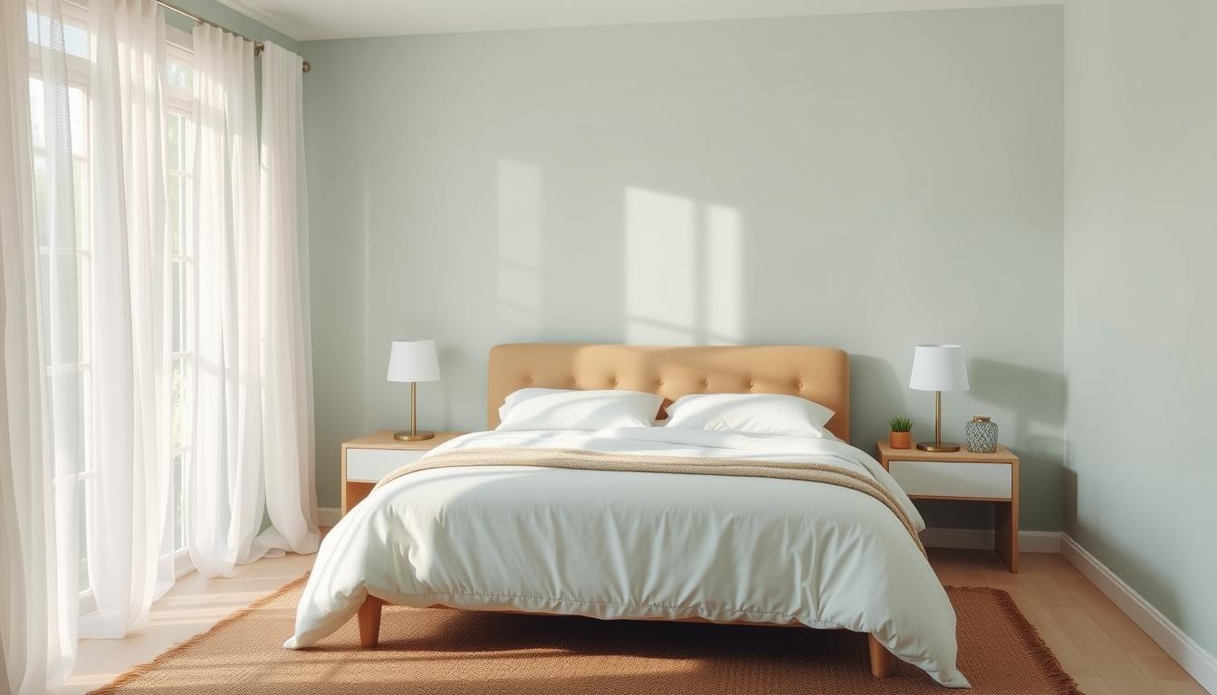
Your color choices should align with your personality and needs. If you’re drawn to vibrant tones, consider using them as accents rather than dominant shades. For a more serene vibe, opt for soft neutrals like beige or light gray. These hues create a soothing backdrop that complements bolder elements.
Think about how you want your room to feel. Do you crave a cozy retreat or a minimalist haven? Your answers will guide your color selection, ensuring the final result matches your vision.
Striking the right balance between bold and neutral tones is essential. Use calming neutrals for walls and larger surfaces to create a peaceful base. Then, add pops of color through decor, bedding, or artwork. This approach keeps the space visually interesting without overwhelming the senses.
Subtle color drenching—where walls, ceilings, and trim share the same hue—can also enhance the room’s tranquility. This technique creates a cohesive, enveloping effect that’s both stylish and sleep-promoting.
"A harmonious palette balances bold accents with calming neutrals, creating a space that’s both inviting and restful."
Before committing to a full makeover, test your chosen hues with small sample patches. This allows you to see how the color looks in different lighting and how it makes you feel. For personalized advice, consult an expert like Pristine Painters to craft the perfect palette for your needs.
Small design details can have a big impact on the overall feel of your space. From accent walls to the right finish, every choice contributes to creating a serene environment. Let’s explore how these elements work together to enhance your room’s tranquility.

Accent walls are a powerful tool for adding depth and visual interest to a room. By choosing a bold or contrasting color, you can create a focal point that draws the eye without overwhelming the space. For example, a soft green accent wall can evoke a sense of balance and calm.
Trim and detail work also play a crucial role. Crisp, clean trim frames the room, adding structure and elegance. When paired with an accent wall, it enhances the overall effect, making the space feel cohesive and intentional.
The finish you choose can significantly influence the mood of your room. Matte finishes are ideal for creating a soft, understated look. They absorb light, reducing glare and creating a soothing atmosphere. This makes them perfect for spaces designed for sleep and relaxation.
On the other hand, glossy finishes reflect light, adding brightness and energy. While they can make a room feel more vibrant, they may not be the best choice for a calm bedroom. For a detailed comparison, check out our guide on satin vs. matte finishes.
"The right finish can transform a room, enhancing both its aesthetic and its ability to promote relaxation."
When selecting finishes, consider the room’s purpose and lighting. Matte finishes are often preferred for their ability to create a serene effect, while glossy finishes can add a touch of sophistication to other areas of the home.
By carefully selecting accents and finishes, you can create a room that’s both stylish and restful. For personalized guidance, consult the experts at Pristine Painters to bring your vision to life.
Creating a tranquil space starts with the right color choices, and Pristine Painters is here to guide you every step of the way. Whether you’re looking to refresh your bedroom or create a calming retreat, our experts have the knowledge and tools to help you achieve your vision.

Choosing the perfect shade for your room can be overwhelming, but it doesn’t have to be. Pristine Painters recommends starting with soft, neutral tones like beige or light gray for a soothing base. These hues create a serene backdrop that pairs well with bolder accents.
Testing your chosen color is crucial. Apply small sample patches to your wall and observe how they look in different lighting throughout the day. This ensures the final result matches your expectations and promotes a restful sleep environment.
Our team also suggests using complementary textures to enhance the room’s tranquility. Pair matte finishes with soft fabrics like linen or cotton for a cohesive, calming effect.
"Professional guidance ensures your bedroom makeover is both stylish and functional, creating a space that truly feels like home."
Ready to transform your bedroom into a peaceful haven? Our experts are just a call away. Schedule a consultation today to receive personalized advice tailored to your needs. Whether you’re looking for color recommendations or application techniques, we’re here to help.
For more information on our services, visit Pristine Painters to learn how we can bring your vision to life.
| Approach | Benefits | Challenges |
|---|---|---|
| Professional | Expert advice, flawless application, time-saving | Higher upfront cost |
| DIY | Cost-effective, personal satisfaction | Risk of errors, time-consuming |
By choosing Pristine Painters, you’re investing in a stress-free experience and a bedroom that promotes relaxation and better sleep. Let us help you create the perfect space for your needs.
The right lighting and textures can transform your space into a haven of tranquility. While color plays a significant role in setting the mood, these finishing touches enhance the overall atmosphere, making your bedroom a place of calm and comfort.
Lighting is a crucial element in creating a restful environment. Experts recommend using warm, low-temperature light to promote relaxation. This type of lighting mimics the soft glow of sunset, signaling to your body that it’s time to wind down.
Adjustable lighting, such as dimmable lamps or smart bulbs, allows you to control the brightness throughout the day. A bedside lamp with a warm shade can create a cozy ambiance, perfect for reading or unwinding before sleep.
Textures add depth and warmth to your room, making it feel inviting and comfortable. Soft fabrics like linen, cotton, or velvet for bedding and curtains create a tactile experience that enhances relaxation.
Layering different textures, such as a plush rug or knitted throw, can also add visual interest without overwhelming the space. These elements work together to create a cohesive, sleep-enhancing environment.
"Details like lighting and textures are the unsung heroes of a restful bedroom. They work subtly but powerfully to create a space that promotes calm and relaxation."
By paying attention to these finishing touches, you can create a bedroom that not only looks beautiful but also supports better sleep. For personalized advice, consult experts who can help you design the perfect space for your needs.
Your personal style and proven design strategies can work together to create a space that’s both beautiful and restful. By blending current trends with timeless elements, you can craft a bedroom that feels modern yet calming. This approach ensures your room reflects your unique taste while promoting better sleep.
Mixing trendy décor with classic design creates a balanced space. Start with a neutral color palette as your foundation. Soft shades like beige or light gray provide a calming backdrop. Then, add trendy accents through pillows, artwork, or rugs. This keeps your bedroom fresh and stylish without overwhelming the senses.
Investing in timeless pieces, like a quality bed frame or a classic nightstand, ensures longevity. Pair these with trendy accessories that can be easily swapped out as styles change. This approach allows you to stay current while maintaining a restful environment.
"Combining trends with timeless design creates a space that’s both modern and serene, perfect for relaxation and better sleep."
Here’s a quick guide to mixing trends with timeless elements:
| Trendy Element | Timeless Element | Result |
|---|---|---|
| Bold patterned pillows | Neutral bedding | Visual interest without chaos |
| Statement lighting | Classic furniture | Modern flair with enduring style |
| Vibrant artwork | Soft wall color | Balance of energy and calm |
Small changes can have a big impact. Try adding a trendy throw blanket or updating your curtains. These updates refresh your space without a full makeover. For more inspiration, explore our guide on house interior color combinations.
By blending your personal style with proven design strategies, you can create a bedroom that’s both stylish and restful. Let your creativity shine while keeping comfort and relaxation at the forefront.
Choosing the right color for your bedroom can make a world of difference in your daily life. From boosting your mood to enhancing relaxation, the hues you surround yourself with play a key role in creating a calming environment. Expert advice can help you navigate the process, ensuring your space is both stylish and functional.
By combining research-backed insights with your personal style, you can craft a bedroom that promotes better sleep. Whether you prefer soft neutrals or bold accents, thoughtful design choices can transform your room into a restful retreat. For more tips on selecting the perfect color, check out our guide on how to choose a paint color.
Ready to take the next step? Pristine Painters is here to help. Schedule a consultation today and let our experts guide you in creating a space that supports relaxation and well-being. A better night’s rest is just a color choice away!
Wall shades can influence your mood and energy levels. Cool tones like blue and green promote calmness, while warm hues like orange may feel too stimulating for a restful environment.
Soft blues and greens are often recommended for their soothing effects. These shades mimic nature and help create a peaceful setting for unwinding.
Yes, accent walls can add depth and personality to your space. Choose a complementary shade or texture to balance the design without overwhelming the area.
Lighting can change how a hue appears. Natural light enhances softer tones, while warm artificial light can make bold shades feel cozier. Choose lighting that complements your chosen palette.
Matte finishes reduce glare and create a soft, calming look, while glossy finishes reflect light and add a modern touch. The choice depends on the mood you want to achieve.
Blend your favorite hues with timeless neutrals. Add textures through bedding, pillows, or furniture to create a space that feels uniquely yours.
For personalized guidance, call (347) 618-7787 or visit pristinepaintersnyc.com to schedule a consultation with design experts.